Building a Scalable Design System for a Call Center Performance Tracking Platform
Overview.
Context
The call center platform was growing rapidly in scope—expanding features for managers, supervisors, and associates. With separate teams designing dashboards, coaching tools, feedback logs, and reporting modules, visual inconsistencies and duplicated efforts were starting to impact usability and velocity. A unified design system was needed to streamline collaboration, ensure consistency, and scale the product efficiently.
Problem
The absence of a centralized design system led to inconsistent UI patterns, duplicated components, and inefficiencies in cross-functional workflows. Developers had to rebuild similar elements repeatedly, and users experienced inconsistencies in behavior, styling, and accessibility across modules.
Objective
Create a role-aware, scalable design system that could support real-time dashboards, alert systems, coaching interfaces, and agent performance views across multiple teams—while aligning with WCAG accessibility standards and responsive design needs.
Discovery.
We audited all existing screens and components used across the call center product. This included real-time dashboards, coaching panels, transcript viewers, and report generators. We documented inconsistencies, usage patterns, and areas of high rework. I collaborated with UX designers, front-end engineers, and product managers to understand common pain points and technical constraints.
Design Audit Result: Over 30 duplicated button styles, 4 different card templates, and inconsistent form field behaviors across modules.
Solution Strategy.
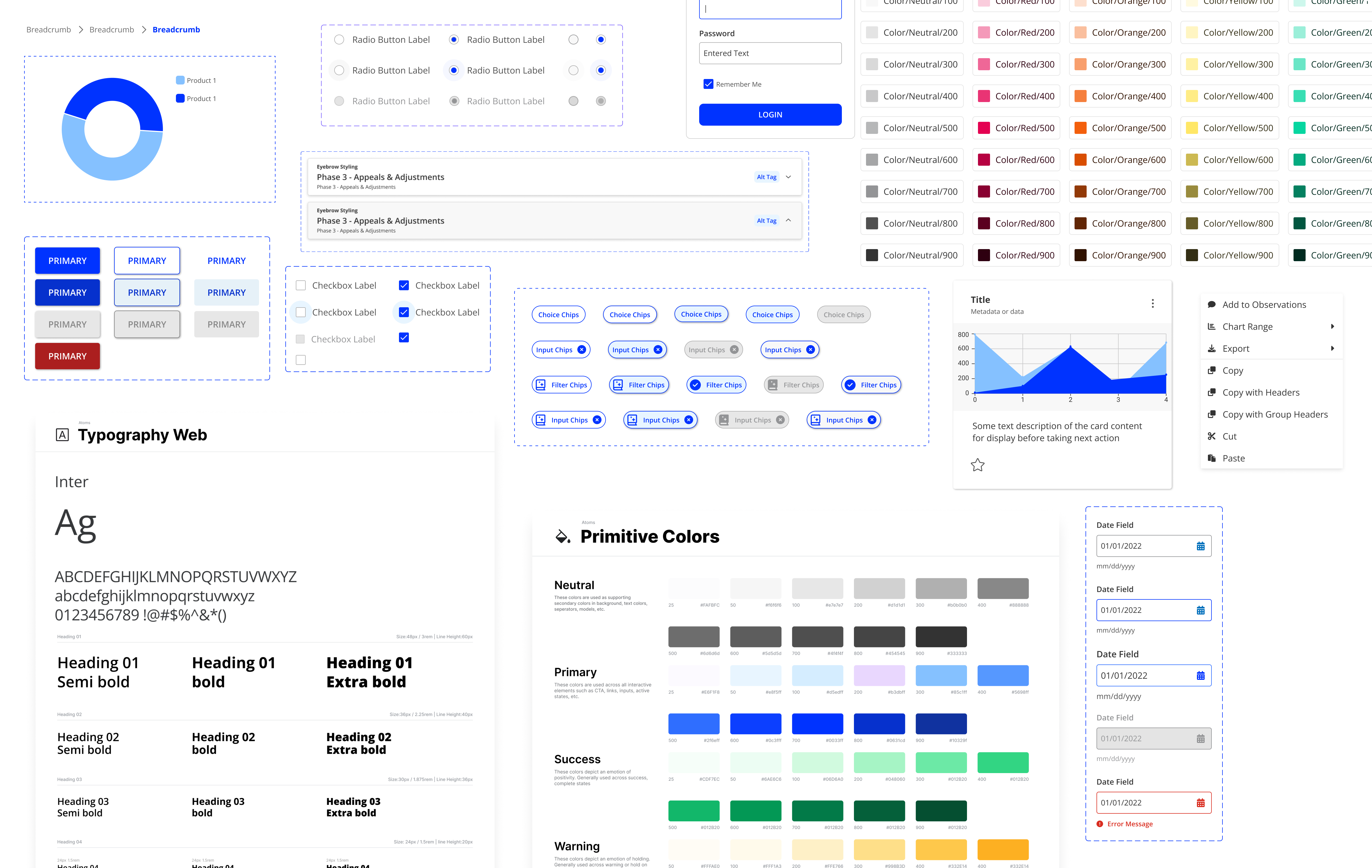
Component Inventory
We created a centralized library of reusable UI components (buttons, cards, modals, tabs, KPIs, charts) in Figma, following atomic design principles.
Theming & Tokens
A flexible theming system was introduced using design tokens for color, spacing, typography, and states—allowing easy future rebranding and dark mode adoption.
Documentation Hub
Each component was documented with guidance on usage, variants, accessibility notes, and code references—ensuring design-dev alignment.
Collaboration & Testing.
- Worked with developers to create live component previews using Storybook
- Conducted internal usability reviews for component flexibility
- Integrated feedback from QA and product to refine edge cases (e.g., empty states, error alerts, live updates)
Impact.
| Outcome | Result |
|---|---|
| Design Reusability | 60% of UI built with system components |
| Figma Maintenance Time | Reduced by 45% |
| Dev Handoff Time | Cut by 35% with consistent tokens + docs |
| Visual Consistency (Audit Re-check) | Increased from 63% to 94% across modules |
| Accessibility Coverage (WCAG 2.1) | Achieved AA compliance across components |
The design system finally gave us a shared language—everything just clicked into place.” – Front-end Developer.